There are a couple of basic elements you always need to get right when it comes to designing an ad creative that converts…
A compelling headline…
Persuasive body copy…
An eye-catching image…
A great call-to-action… etc.
However, after analyzing the top ads from a few major brands and direct response companies, we pinpointed a few unique design “tricks” that go beyond the basics of headlines and CTAs. These tricks can give you a 2-3x lift in CTR when implemented correctly.
This post outlines 3 of our favorites.
Check ’em out.
CTR Trick #1: Selectors
The standard call-to-action practice is to have a “button” with a compelling phrase. The psychology being that people are used to seeing and clicking on buttons. The mere fact that they see a button makes them want to click it even more. This is sound advice and can work very well.
However, if you want to test something different (or in addition to) a button CTA, why not test selectors to your ad creative.
Selectors are small buttons/phrases that your prospect can click to “identify” themselves based on their demographic or some personal trait.
Stuff like… their age, sex, income, astrological sign, etc.
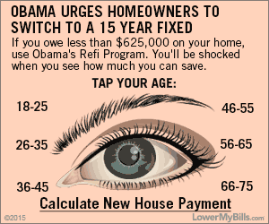
One advertiser that uses selectors really well is LowerMyBills.com, a site that helps consumers get quotes on insurance, loans, mortgages, help with debt consolidation, etc. Selectors are pertinent for their market since insurance rates, mortgage rates and debt consolidation laws often vary depending on your age, income and location.
Here are an example of an ad for a mortgage refinance offer:

This ad works for a few reasons:
- It references recent news — “Obama Waves Refi Requirement”
- It claims the prospect can save money (“You’ll be shocked when you see how much you can save”)
- There are multiple calls to action. The selectors — “Tap Your Age” — as well as the “Calculate New Payment” text.
LowerMyBills uses selectors in almost all of their ads. Here are two more examples:

Besides mortgages, there are a couple of other niches that love using selectors.
Here’s an ad from Astrology Answers:

Anyone interested in astrology will be curious to see their “shocking” horoscope. Being able to click on their actual sign is going to tempt them even more, since the information they’ll eventually receive is tailored just for them.
Besides astrology, any sort of advice site or site where you pay to talk to an expert tends to use them.
Here’s an ad from HealthCareMagic.com, a site where you can consult an online doctor.

Selectors tend to work well because they’re unique. Not many advertisers are using them. Anything that stands out and isn’t traditionally used will catch your prospect’s eye. There’s probably some way you can use them in your ad creative strategy even if you’re not in the mortgage refinancing, medicine or astrology market.
CTR Trick #2: Emotional Faces
Research by behavioral psychologist and body language expert Paul Ekman has uncovered that there are a few universal facial expressions that we all share, regardless of culture, racial background or location. These expressions are related to the emotions of disgust, fear, anger, happiness, sadness.
Faces that show extreme versions of these 5 emotions can work very well in your ad creative. When someone sees a face showing a universally recognized expression related to a powerful emotion they are going to be curious. They’ll want to click the ad to discover what is making this person feel this way.
Here’s one example of a display ad from a company that sells an info-product for people who want to naturally improve their vision:

In addition to her expression of shock and surprise, her eyes are staring right at you. Having eyes that stare out at you can also help improve CTR. Think about this: what is your natural reaction when you see someone out of the corner of your eye staring at you? If you’re like most people, you’re going to look at them and wonder why they’re staring at you. This concept holds for display ads.
Although extreme emotions tend to work best, you can also test out faces that show more subtle emotions.
Take this ad from Full Sail University:

The girl in the picture is looking straight at you with a devious smirk. It’s going to get your attention anytime someone looks like they’re “up to no good”, knows something you don’t or is hiding a secret from you. You’ll want to know what they know that you don’t.
CTR Trick #3: “Hand Written” Ads
People are used to seeing professionally designed ads with fancy fonts and high-quality pictures.
You can go the opposite route and test an “ugly” ad.
Many display advertisers are doing well with ads that look kind of crappy and ugly, specifically using fonts that look like hand writing or using a tablet to actually hand write the copy themselves.
Here’s one example from a very successful weight loss product:
This ad was not “hand written” per say, but the font and design does look closer to a hand drawing than an ad that a professional company might use.
Here’s another ad from another weight loss product:

Now, perhaps you’re saying..
“I’m not in the weight loss industry. I can’t get away with this. My product is “serious”, not sleazy!”
It’s true that you’ll see many more “less professional” ads in the weight loss market. However, this shouldn’t stop you from toning down the level of “shock” to something that’s appropriate to your market. Here’s why: the weight loss and supplement industries are two of the most competitive and most profitable markets out there. They’re very good at testing different strategies and concepts. They know what styles and images currently get peoples’ attention.
Conclusion
Making a few small changes to your ad’s copy/image can often give you a 2-3x lift in CTR. The specific tactics shown in this post have been proven to work for some of the best marketers and advertisers today, meaning they will likely work for your business as well. Test out a few in your own display ads and see if you can’t see better results.
Great post – very interesting and I will be trying some of these ideas in my ads, for sure.