“Imitation is the sincerest form of flattery.”
– Charles Caleb Colton
The best way to see higher conversions and sales with paid advertising is NOT by using a new, novel approach…
It’s to be a copycat.
Specifically, look and see which style of ad creatives your competitors and large advertisers outside of your industry use.
You’ll notice that most successful advertisers use similar formulas. This can refer to ad copy, colors or even just where they put the image, the copy and the call-to-action.
None of this is by chance. Savvy advertisers consistently test different elements until they find one that works.
You can piggyback on their efforts by taking what they’ve already discovered to work and using it in your own ads.
Here are 6 ad creatives that have garnered millions of impressions.
We’ll show you what they did right and wrong.
Plus, how you can ethically steal their ideas and implement them into your own advertising campaigns.
Ad #1: Zulily
Zulily is an eCommerce clothing store and were one of the highest spending Display advertisers in 2014.
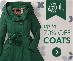
The Breakdown
- Green Jacket on the Left Side — Seasonality aside, they didn’t just randomly pick a jacket to put on their ad creative. They’ve probably tested a few different items/images and discovered the jacket is what leads to the highest CTR/sales.
- Short Copy on the Right Side — The copy is short, but to the point. Plus, specific numbers also tend to work well. Using “up to 70% off”, is more effective than “huge discounts” or “great deals”. Specificity and numbers are powerful in ad copy.
- CTA in the bottom right-hand corner — The green arrow in the right-hand corner does not call out, but it does make you want to click it. They could have added some text or made it stand out a bit more, but this seems to work for Zulily.
- Brand Logo Above Copy — The image also contains their logo with a bit of branding, but it’s at the very top. It doesn’t catch your eye. You might not even notice it once you get into the copy.
- Bright Green — The green color of the jacket against the grey background catches your eye. It’s a shade of green that’s pleasing to the eye. It’s nice to look at.
Takeaways
- Test Out Different Items — If you’re in eCommerce (or selling anything) you’ll want to test out various items. Maybe a jacket works, maybe pants work, maybe a leopard print thong works… who knows? Test out different items and see which one resonates the most with your prospects.
- Bold colors — Try to include bright, bold, “happy” colors in your ad creatives. These are the beautiful greens, oranges, blues, purples and reds. Find colors that are pleasant to look at. People like looking and nice colors and like clicking on ads that contain them.
- Image on the left side — This isn’t by chance. No doubt Zulily tested placing the product image in different spots. You’ll see later in this post other advertisers are doing the same thing. Test putting the image and copy on the left and right sides.
- Use Numbers — It’s tempting to click any ad that says “70% off”. People love deals. But the real power behind this statement is the number. It’s specific. Specificity tends to work better than generality when it comes to copywriting.
Ad #2: Western Union
The same service your grandfather used to send love telegrams to your grandmother is STILL in business. Only no one sends telegrams anymore — they send money. Western Union is now one of the biggest online money transfer services.
You’ll notice the structure of Western Union’s ad is similar to the Zulily ad, even though they’re in completely different industries.

The Breakdown
- Computer (presumably sending money) on the left side — Same format as Zulily.Benefit driven copy to the right of the image — Again, similar to what you saw in Zulily (notice a pattern here?).
- CTA in the bottom right hand corner — Again, same as Zulily! The only difference is they chose to use a button with a call-to-action. “Send money now >>” is a great call-to-action. It tells them exactly what they should do on the next page. It’s not a general CTA, like “Get Started Now”, which most companies use.
- Social proof (4 stars) — The 4 stars provide social proof. They make you trust the service more. Your eyes gloss over the part about their app being rated 4 stars. Most people will assume the 4 stars refer to Western Union as a whole.
- Bright Background — Zulily made the jacket stand out with the pleasant green. Western Union makes the entire ad stand out with a bright yellow background.
Takeaways
- Test Out Proven Formulas — Zulily and Western Union are advertisers in opposite niches. BUT, they have the exact same ad layout. The reason why? It works! Test it out yourself.
- Add Social Proof — The 4 stars add credibility. What kind of social proof can you add to your ad creatives? Maybe you have a testimonial, rating, certification, etc. Social proof is extremely powerful. You should add it in whenever you can.
- Benefit Driven Copy — The biggest mistake people make with ad copy is attempting to be clever or cute. Clever and cute ad copy wins advertising awards, but usually doesn’t make many sales. It’s not clear enough and prospects might not understand it. You want to aim for clarity.However, adding a bit of personality isn’t bad. Western Union was able to do this with just the simple headline “Send money quick as a click”. It rhymes. It’s clever but clear.
Advertiser #3: Instant Checkmate
One of the many benefits of the internet is the ability to dig up dirt on anyone. Got arrested at one point in your life and would love to forget it? Well, the internet doesn’t forget. One of the best sites to dig up dirt on someone is Instant Checkmate. Instant Checkmate is a background checking service.
They spend over $1M/year on display. There must be a lot of digging going on.
Instant Checkmate is a great example of how to effectively use Google text ads.
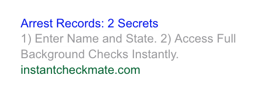
The Breakdown
- Powerful Headline — “Arrest Records: 2 Secrets”. “Arrest” and “Secret” are powerful words. You’re going to wonder what is going on whenever you see these two words together in a sentence. Who was arrested? What are the two secrets?
- Symbols & Numbers — The parentheses and “1)” and “2)” catch your eye. They also make it seem like an easy, two-step process. It tells the user exactly what to do once they click on the ad. It also makes it seem less like an advertisement.
Takeaways
- Power Words — “Arrest” and “Secret” are both powerful words. They evoke strong emotions in your prospects. “Arrest” and “secret” might not work for most businesses, but each market has its own power words. For example, “glowing skin” is a power word phrase for someone who sells a health and beauty product.. Find the power words for your market and use them in your ad copy.
- Eye Catching Symbols — Symbols (even something as simple as parentheses) grab attention. Money signs, ampersands, copyright symbols and numbers work well in display ads.
- Give Them “Directions” — Instant Checkmate gives the two step process for using their service. It makes everything seem simpler and acts like a big call-to-action.Can you give directions in your own ad? For example, if you have a SaaS software cloud product, you could test out: “1) Access Your Free Account 2) Back-up Your Precious Data Instantly.”
Advertiser #4: Newsmax Media
Newsmax is a conservative news media organization. The ad below leads to a lead generation survey regarding Obama’s performance. This is a simple, but powerful ad.
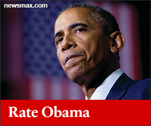
The Breakdown
- Large picture of Obama — We live in a culture that loves celebrities and the famous. Famous figures can work very well in ads if there is some tie in to the product or landing page. This ad in particular uses the image of a famous figure who is also very controversial for their specific audience.
- Facial Expression — The real reason why this ad catches your attention is because of Obama’s facial expression. Pursed lips is a sign of distress. Strong facial expressions like anger, sadness, surprise and distress catch your eyes. People will see Obama’s face in this ad and wonder what he’s distressed about.
- It involves the prospect — People love to give their opinion. The “Rate Obama” implies they’ll be able to hop up on their own personal soap box and get involved.
- Republican Red — Red is not just a bright, attention grabbing color. It’s also the color associated with conservatives and the Republican party. You don’t usually see red and Obama combined. This is more subtle way to grab attention.
Takeaways
- Test Out People — They don’t need to be famous like Obama, but try testing people vs. objects.
- Test Out Different Emotions — Test out different facial expressions. Maybe anger works well. Maybe someone looking really happy works well. Maybe surprise works well. We can’t help but be curious when we see someone displaying some extreme emotion.
- Involve Your Prospects — Is there any way you can get your customers to interact with something on your page? They’re more likely to click if there is the implication they’ll be able to get involved in some way. A quiz, survey or game can work very well here.
Advertiser #5: LowerMyBills
LowerMyBills.com is a lead generator for mortgages, mortgage refinancing, car loans, auto insurance, life insurance and other financial products.
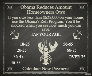
- Crabs and Anchors — These are strange images that have nothing to do with the product or the copy. They simply catch your attention. People do not associate these objects with loans and mortgage refinance, so they’re going to be curious when they see an ad like this.
- Selectors — Selectors are the age ranges shown next to the lobster. These are little “buttons” that allow people to put themselves into a group. It gives them more places to click and gives the appearance that the page they’ll see after is tailored to their age range.
Takeaways
- Test Strange Images — The crab, anchors and ship wheels follow a nautical theme… yet LMB has nothing to do with boats! The point of these symbols and images is to get your attention. It might not have to do with your industry… but try it out! You have to be careful with this approach. People don’t like feeling duped – seeing one thing on the ad creative and then seeing another on the landing page might give them that feeling.
- Test Selectors — “Tap Your Age”. The whole add with these selectors is like one big CTA. This gives the ad a personalized feel, even though the landing page itself will not be personalized. How can your prospects “group” themselves? Age? Gender? Demographic? A personalized experience is key when it comes to display advertising.
Advertiser #6: UTI.edu
Universal Technical Institute is a university for people who want to become auto, boat or motorcycle technicians.
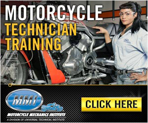
The Breakdown
- Woman On The Right-Hand Side — Attractive women tend to lead to a higher CTR. There is also a connection between biker culture and attractive women. The magazines, the photoshoots, the common belief that women find men on motorcycles attractive, etc.
- Basic Copy on the Left-Hand Side — There’s no ‘body copy’ in the ad. It’s just a headline that states exactly what UTI is. No cuteness. No cleverness. Not even an attempt at a “creative” headline. As famous copywriter Gary Halbert once said, “Sometimes you just need to sell the damn thing.”
- Logo in the lower left-hand corner — Logos tend to build credibility, even when it’s for the advertiser themselves. This is a better idea than just having a little bit of text. You look at it and it screams “credibility”. Although this has to do with the design of the logo, UTI’s logo has the appearance of some sort of certification.
- Large CTA Button in the right-hand corner — Again, a large CTA button in the lower right-hand corner. Many other ads use this same exact positioning
Takeaways
- Test out attractive people — Men. Women. Cute dogs. Whatever applies to your niche. Ads with attractive women tend to work better EVEN if your target audience is women. Men imagine being with the woman, women trust other women.
- “Just sell it” — Test out very simple copy. State explicitly what your service is or the benefit the prospect will receive.
- Test with and without a logo — Logos (even your own!) can add credibility. UTI’s looks particularly authoritative — like it could be the “seal of approval” or some sort of Motorcycle Technician University Authority. It’s okay if you have a more modern logo that doesn’t look as authoritative. Still, try testing it in certain positions.
Conclusion
“You can recognize a pioneer by the arrows in his back.”
The best way to see results is not to reinvent the wheel or be a pioneer. You’ll see a lot better results when you use proven formulas. You already know they’re more likely to work for you because it’s worked for someone else, even if it’s outside your industry.
Fantastic advice.
As a ‘sometimes’ copywriter, these examples are great to emulate. Good to touch base with the basics again.
Great education on this site no matter the topic
Thanks – W